Illegal character found in search text!
[Only A - Z, a - z and 0 - 9 are allowed]
What is CSS
Instead of formatting every single element on every single page the Cascading Style Sheet (CSS) concept was developed. It gained traction in the mid 1990s and the current version is CSS3 which is commonly implemented in all modern browsers though the implementation varies a bit from browser to browser.
CSS let you format all HTML tags commonly on your website or you can assign styles to one or more tags either by referring to their assigned ID or CSS class. This is very smart because you can make a centralized management and still have the flexibility to style specific elements or group of elements on your website.
In n-gen CMS we have selected a minor (but important) subset of the a number of the most commonly used HTML tags which you can easily style from the Style Manager.
Besides these elements we have made an »Additional user defined styles« field where you can insert your own styling in case you find n-gen CMS styling insufficient.
We have have strived to make styling very easy for you but still the Style Manager is quite a busy form as you can see to the right. It will always be a balance between the easy of use vs. the degree of customization.
If you have suggestions for improvement please contact n-gen.net.
How it works.
The Style Manager stores the values you enter in your database. These values are then retrieved by two handlers ( ashx files) that are integrated with your index.aspx file as if the were classic external Style Sheets (css-files) and thereby provide a very easy and dynamic way of applying the style rules to the HTML elements of your website. Using this approach means that you will never have to write an single line of CSS but if you want you still can do it.
What is the unit em?
In Cascading Style Sheets, the em unit is the height of the font in nominal points or inches. The actual, physical height of any given portion of the font depends on the user-defined DPI setting, current element font-size, and the particular font being used.
To make style rules that depend only on the default font size, another unit was developed: the rem. The rem, or root em, is the font size of the root element of the document. Unlike the em, which may be different for each element, the rem is constant throughout the document.
[Source: Wikipedia]
The Style Manager
How to change the Look and Feel of your website
The access for the Style Manager is found on the front facing side of the Admin Cube: 
Or as the third icon from the right if you prefer the Admin Ribbon:

When clicking either of the icons you will open the Style Manager. The values depicted below are just examples. The values of your Style Manager will be different if you have kept the default installation values.

Example look of the Style Manager, click to enlarge.
Style Manager content and fields explained
When working with text sizes in the Style Manager for either Page text size, Headings (h1 - h6) text sizes, Menu text size or Footer text size you have to qualify your values with a unit.
Here are som common and accepted relative and absolute units:
- em or rem (relative em),
- % (percent),
- px (pixels),
- pt (points).
You can use many more units and and you can mix between different types; i.e. have absolute units in your header (i.e. px) and relative units in your body, i.e. % or rem.
Read more about units on w3schools.com website.
The Style Manager contains three sliders. The slider values will always be in pixels:
px
All fields containing color values will have the same color as the color you choose.
Clicking or tapping a color value field opens a color picker.
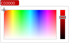
All colors must be six digit hexadecimal (HEX ~ 0-9, A-F) notation corresponding to 24 bit color depth ("True Color")
The Style Manager is divided into four sections below each other:
The top section contains:
- the Style Manager icon (which is a shortcut to the Admin Cube)
- a »Save Style Values« button that when clicked stores the field values in your database,
- an »Export styles as a skin file« button that when clicked writes the field values to a .skin file,
- an »Import Styles from skin file« dropdown list that when clicked shows you available .skin files available in your n-gen CMS.
The Page section consists of five rows:
- row, from left:
- a field with the Id number. This is only for future use.
- a field with the style name. This name is for easy reference. The .skin file created during export will be named [style name].skin
- a field with the background color of your page. This will not affect the color of the header or the footer.
- a field with the fonts for all the page except for the menu. Remember that not all forts are supported by all platforms.
That is why a hierarchic listing of fonts makes sense. Font names are separated by »,« (comma)
Note: Font names that contains spaces must be enclosed in " ", i. e. "Times New Roman".
- row, from left:
- the two first fields hold the value of the general font size and color.
Note that sizes can be applied as em or root em (rem), percent (%) or pixels (px), This goes for all font sizes.
- the last four fields contain the color values of hyperlinks.
(link hover has no effect on devices without a pointer, i.e. a SmartPhone or an iPad )
- row, from left:
- All six fields hold the sizes of the text heading hierarchi. Use em, rem, % or px at your choice.
- row, from left:
- All six fields hold the colors of the text heading hierarchi.
- row, from left:
- only one field. In this field you can write whatever CSS code you want, i.e. a custom class for certain images.
(the field can hold a maximum of 65.536 characters - which should be sufficient for most custom styles)
In the custom CSS field you can in principle write all valid CSS syntax: If you create your own classes you can style them using this field and you can also overwrite some of the built-in default behavior.
Some of the built-in classes are:
.header
.nav
.flex-container
.updateVis
.footer
.photoThumbContainer
.galleryPhoto
.searchInput
[The . (dot) in front of the denotes that the name to follow is a class, the trailing {} (curly brackets is where the CSS attributes and values are written.]
Example a.
The class »photoThumbContainer« is present in the file »photoIndex.aspx« (the thumbnail page) and the class »galleryPhoto« is present in the file »photoShow.aspx« (The scaled single photo page). So if you type:
.photoThumbContainer {filter: grayscale(100%);}
.galleryPhoto {filter: grayscale(100%);}
in your custom CSS field the first line will make all you thumbnail images on the file »photoIndex.aspx« gray-scale and the second line will make all your scaled photos in »photoShow.aspx« gray-scale.
Example b.
Similarly the file »index.aspx« contains a class »updateVis« which styles the text for "Last updated date / time" so that it will appear with the same font and color as the main text but down-scaled to 75% in size. If you want the text not to be visible to any visitors of your pages you can simply type:
.updateVis {visibility: hidden;} or
.updateVis {display: none;}
You will also find that some of Themes you can apply to you n-gen.net CMS contain various custom CSS styles in order to skin some elements.
The Menu & Search box section consists of four rows:
- row, from left:
- two fields with the colors of the background, top and bottom.
(If you want a solid color just pick the same value)
- two fields with the colors of the background, top and bottom, when the pointer hovers over the menu item,
- two fields with the text color and the text color when the pointer hovers over the menu item.
Note: The hover colors will have no effects when the mobile menu is displayed.
- row, from left:
- the same six fields as above but for the sub menus (level 1, 2 and 3)
Note: Most mobile devices cannot render level 3 or even level 2. Read more about menu items here...
- row, from left:
- a field with the size of the menu text. The size can be applied as em (em) or root em (rem), percent (%) or pixels (px).
- a dropdown list that aligns the "menu bar".
Note: If »Always show mobile menu« is selected none of the above mentioned "Hover" values apply.
- a slider with the value for the mobile menu break point. The range is min. 475px, max. value is 1085px.
If the window size (or resolution of a screen) is below the break point value, the menu will transform into the mobile menu.
- a field with the fonts for the menu. Remember that not all forts are supported by all platforms.
That is why a hierarchic listing of fonts makes sense. Font names are separated by »,« (comma)
Note: Font names that contains spaces must be enclosed in " ", i. e. "Times New Roman".
- row, from left:
- a slider that holds the value of the space between menu items in the menu bar.
- a field with the color of the horizontal space between menu items in the menu bar (desktop menu)
The item divider has a solid color, If you do not want a colored vertical line between menu items set to 0px.
- a checkbox which when checked keeps the desktop menu visible when a page has more content that can be displayed in the browser window without vertical scroll. The menu will shrink and become semi-transparent and stick to the upper edge of the browser window when checked. When checked the »To-the-top-of-the-page-button« in the lower right corner (footer) will visible regardless of the window content.
- a checkbox the when checked makes all menu text in bold.
- two fields which give the position of the search box. The first field is the distance (offset) from the browsers right edge, the second field is the offset from the top edge of the browser window. Values are always measured in pixels and the position is absolute which means that it will always be displayed regardless of the content of the header and the page. If you do not want to display the search box at all simply set the values to -200px in both fields.
The Footer section consists of one row:
- a checkbox that makes the number of current users visible (checked) or hidden (unchecked) in the left side of the footer.
- a field with the text size of the footer. The footer uses the same font as the rest oft the page (except the menu).
- two fields with the colors of the footer background, top and bottom.
- a slider for the amount of pixels that rounds the corners of the footer and the menu bar and submenu items.
If set to 0px the footer and menu elements will be rectangular.
If set to 32px the footer and menu elements will be oval (without any straight vertical lines)